For my TACON talk, I built a small shop called Claw & Chew. It sells a hamster plush wearing a crab costume.
The customer wants one thing: add the plush to their bag. The test does exactly that, then checks the bag count.
The test passes. The customer can’t click the button.
That failure is the starting point for my testing strategy. Before choosing a runner or counting tests, decide what a passing test should prove.
Three Contracts of a Component
By a component’s contract, I mean what someone using it should be able to rely on. For testing, I separate that into three questions:
- Behavior: Does an action produce the expected result? Adding the plush should update the bag; completing checkout should show a confirmation.
- Accessibility: Can people operate the interface and understand its state? Keyboard input, focus, accessible names, and selection should agree with the visible UI.
- Appearance: Does the component match the approved design in the states we care about? Check spacing, colors, and whether labels fit.
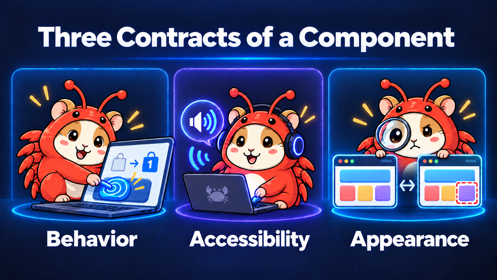
A passing purchase test gives us evidence about behavior. We still need to check keyboard operation and appearance. Each contract needs assertions that can expose its failures.
1. Behavior: Can the Customer Complete the Purchase?
The behavior contract covers an action and its observable result. For the shop, the customer must be able to reach the purchase controls and use them to place a demo order.
One Line of CSS, One False Green
The product card has a decorative layer above its content. A CSS change makes that layer intercept pointer events:
 .product-decoration {
   position: absolute;
   inset: 0;
   z-index: 2;
-  pointer-events: none;
+  pointer-events: auto;
 }
The button still exists. Its accessible name stays the same. Its Vue click handler still works when an event reaches it.
Here’s the jsdom test from the demo:
// app/catalog/ProductCard.dom.test.ts
import { expect, test } from "vitest";
import { render, screen } from "@testing-library/vue";
import userEvent from "@testing-library/user-event";
import ProductCardHost from "../../tests/fixtures/ProductCardHost.vue";

test("adds a plush to the bag through the product button", async () => {
  const user = userEvent.setup();
  render(ProductCardHost);

  const add = screen.getByRole("button", {
    name: "Add The little claw plush to bag",
  });
  await user.click(add);

  expect(screen.getByLabelText("Bag count")).toHaveTextContent(
    "1 items in bag",
  );
});
ProductCardHost supplies the product and connects its add event to a visible bag count. The project’s setup imports the jest-dom matchers.
This test uses a semantic query and a user-event helper. Those are good choices. They don’t give jsdom a rendering engine.
jsdom implements browser standards inside Node.js, but doesn’t perform layout or rendering. It can’t determine which overlapping element occupies the click position. The simulated interaction reaches the selected button, and the count increases.
Try the Blocked Button
 CLAW & CHEW
The little claw plush
€28Your new emotional support crustacean.
Looks clickable.
Is it?
Try adding the plush, then switch off the defect.
pointer-events: auto;A direct DOM click skips hit testing.
What this demonstrates
The overlay blocks mouse and touch input; keyboard activation still works. The direct click illustrates the bypass. This demo does not run jsdom or Vitest.
View the runnable source
<script setup lang="ts">
import { ref } from "vue";
import "./demo.css";
const broken = ref(true);
const reveal = ref(false);
const count = ref(0);
const productButton = ref<HTMLButtonElement | null>(null);
const feedback = ref("Try adding the plush. What happens?");
function reset() {
broken.value = true;
reveal.value = false;
count.value = 0;
feedback.value = "Try adding the plush. What happens?";
}
function add() {
count.value++;
feedback.value = "Added to your bag.";
}
function directClick() {
productButton.value?.click();
feedback.value = "Direct click received. The overlay was bypassed.";
}
</script>
<template>
<section class="click-lab" aria-label="Blocked click playground">
<header class="lab-bar">
<span class="lab-eyebrow">INTERACTIVE EXAMPLE</span>
<button class="reset" type="button" @click="reset">
Reset demo <span aria-hidden="true">↺</span>
</button>
</header>
<div class="lab-body">
<article class="product-card">
<div class="product-art">
<img
src="/images/testing-contracts/plush.png"
alt="Hamster plush in a red crab costume"
width="480"
height="480"
loading="lazy"
/>
<span class="shop-brand">CLAW & CHEW</span>
</div>
<div class="product-details">
<div class="product-title">
<h3>The little claw plush</h3>
<span>€28</span>
</div>
<p>Your new emotional support crustacean.</p>
<div class="button-stack">
<button ref="productButton" type="button" class="buy" @click="add">
Add to bag <span aria-hidden="true">+</span>
</button>
<span
class="decoration"
:class="{ revealed: reveal }"
:style="{ pointerEvents: broken ? 'auto' : 'none' }"
aria-hidden="true"
@click="
feedback =
'The overlay caught your click. The bag is still unchanged.'
"
/>
</div>
<output aria-label="Bag count">{{ count }} items in bag</output>
</div>
</article>
<div class="experiment">
<span class="step-label">01 / TRY IT</span>
<h4>
Looks clickable.<br />
Is it?
</h4>
<p>Try adding the plush, then switch off the defect.</p>
<div class="control-row">
<button
type="button"
class="defect-control"
:aria-pressed="broken"
@click="broken = !broken"
>
<span>Overlay defect</span
><span class="toggle" aria-hidden="true"><span /></span>
</button>
<label
><input v-model="reveal" type="checkbox" /> Reveal overlay</label
>
</div>
<div class="css-line">
<span>.decoration</span
><code
>pointer-events: <b>{{ broken ? "auto" : "none" }}</b
>;</code
>
</div>
<div class="bypass">
<span class="step-label">02 / COMPARE</span>
<p>A direct DOM click skips hit testing.</p>
<button type="button" class="direct" @click="directClick">
Call element.click() <span aria-hidden="true">→</span>
</button>
</div>
</div>
</div>
<footer class="lab-feedback">
<span class="status-dot" aria-hidden="true" />
<p role="status">{{ feedback }}</p>
</footer>
<details class="lab-note">
<summary>What this demonstrates</summary>
<p>
The overlay blocks mouse and touch input; keyboard activation still
works. The direct click illustrates the bypass. This demo does not run
jsdom or Vitest.
</p>
</details>
</section>
</template>
<style scoped>
.click-lab {
container-type: inline-size;
margin: 24px 0;
border: 1px solid #414858;
border-radius: 14px;
overflow: hidden;
background: #181d29;
color: #e9ebf2;
font:
14px/1.5 system-ui,
sans-serif;
text-align: left;
}
.click-lab *,
.click-lab *::before,
.click-lab *::after {
box-sizing: border-box;
}
.click-lab button {
font: inherit;
cursor: pointer;
}
.click-lab button:focus-visible,
.click-lab input:focus-visible,
.click-lab summary:focus-visible {
outline: 3px solid #ffe291;
outline-offset: 4px;
}
.click-lab .lab-bar {
display: flex;
justify-content: space-between;
align-items: center;
padding: 12px 20px;
border-bottom: 1px solid #343b4b;
}
.click-lab .lab-eyebrow,
.click-lab .step-label {
font:
600 10px/1.5 ui-monospace,
monospace;
letter-spacing: 0.1em;
color: #a9b1c5;
}
.click-lab .reset {
border: 0;
padding: 8px 0 8px 12px;
background: transparent;
color: #b9c1d3;
font-size: 12px;
}
.click-lab .reset span {
margin-left: 7px;
font-size: 17px;
}
.click-lab .lab-body {
display: grid;
grid-template-columns: minmax(0, 1fr) minmax(0, 1fr);
gap: 28px;
padding: 24px;
align-items: center;
}
.click-lab .product-card {
border: 1px solid #484a53;
border-radius: 10px;
overflow: hidden;
background: #f9f4eb;
color: #282421;
}
.click-lab .product-art {
position: relative;
aspect-ratio: 1.12;
background: #ffc298;
overflow: hidden;
}
.click-lab .product-art img {
display: block;
margin: 0;
width: 100%;
height: 100%;
object-fit: cover;
border-radius: 0;
}
.click-lab .shop-brand {
position: absolute;
top: 12px;
left: 12px;
color: #4b3028;
font:
700 9px/1.2 system-ui,
sans-serif;
letter-spacing: 0.12em;
}
.click-lab .product-details {
padding: 16px;
}
.click-lab .product-title {
display: flex;
justify-content: space-between;
gap: 12px;
align-items: baseline;
}
.click-lab .product-title h3 {
margin: 0;
color: #282421;
font:
700 16px/1.3 Georgia,
serif;
letter-spacing: -0.02em;
}
.click-lab .product-title > span {
font-size: 13px;
white-space: nowrap;
}
.click-lab .product-details p {
margin: 7px 0 16px;
font-size: 11px;
line-height: 1.5;
color: #675f58;
}
.click-lab .button-stack {
position: relative;
}
.click-lab .buy {
display: flex;
justify-content: space-between;
width: 100%;
padding: 11px 14px;
min-height: 44px;
border: 0;
border-radius: 5px;
background: #332e2b;
color: #fff8ef;
font-size: 13px;
font-weight: 600;
}
.click-lab .buy > span {
font-size: 18px;
line-height: 20px;
}
.click-lab .decoration {
position: absolute;
inset: 0;
z-index: 2;
border-radius: 5px;
}
.click-lab .decoration.revealed {
border: 2px dashed #ff7967;
background: repeating-linear-gradient(
135deg,
#f26f6940 0 7px,
#f26f6980 7px 14px
);
}
.click-lab output {
display: block;
text-align: center;
margin: 10px 0 0;
color: #72675d;
font-size: 11px;
}
.click-lab .experiment {
min-width: 0;
}
.click-lab .experiment h4 {
margin: 9px 0 12px;
color: #f2f1f6;
font:
600 26px/1.12 system-ui,
sans-serif;
letter-spacing: -0.04em;
}
.click-lab .experiment p {
margin: 0 0 18px;
color: #b9c1d3;
font-size: 13px;
line-height: 1.6;
}
.click-lab .control-row {
border-top: 1px solid #3a4151;
border-bottom: 1px solid #3a4151;
padding: 4px 0 12px;
}
.click-lab .defect-control {
display: flex;
justify-content: space-between;
align-items: center;
width: 100%;
min-height: 44px;
padding: 5px 0;
border: 0;
color: #edf0f6;
background: transparent;
font-size: 13px;
}
.click-lab .toggle {
width: 30px;
height: 18px;
border-radius: 12px;
padding: 3px;
background: #626c7d;
}
.click-lab .toggle > span {
display: block;
width: 12px;
height: 12px;
border-radius: 50%;
background: #fff;
}
.click-lab .defect-control[aria-pressed="true"] .toggle {
background: #ed91d8;
}
.click-lab .defect-control[aria-pressed="true"] .toggle > span {
transform: translateX(12px);
background: #2b2230;
}
.click-lab label {
display: flex;
gap: 8px;
align-items: center;
color: #bec6d6;
font-size: 12px;
cursor: pointer;
min-height: 30px;
}
.click-lab input {
width: 14px;
height: 14px;
accent-color: #ed91d8;
margin: 0;
}
.click-lab .css-line {
display: grid;
gap: 4px;
padding: 12px 0;
font:
11px/1.6 ui-monospace,
monospace;
color: #9aa5ba;
}
.click-lab code {
padding: 0;
background: transparent;
color: #ced3e0;
font: inherit;
white-space: normal;
overflow-wrap: anywhere;
}
.click-lab code b {
color: #ed91d8;
font-weight: 500;
}
.click-lab .bypass {
margin-top: 12px;
}
.click-lab .bypass p {
margin: 7px 0 8px;
font-size: 12px;
}
.click-lab .direct {
display: flex;
width: 100%;
justify-content: space-between;
padding: 9px 0;
color: #edb8df;
border: 0;
background: transparent;
font:
12px/1.5 ui-monospace,
monospace;
min-height: 40px;
}
.click-lab .lab-feedback {
display: flex;
align-items: baseline;
gap: 9px;
padding: 12px 20px;
border-top: 1px solid #343b4b;
background: #141925;
}
.click-lab .status-dot {
flex: 0 0 6px;
height: 6px;
border-radius: 50%;
background: #ed91d8;
}
.click-lab .lab-feedback p {
margin: 0;
color: #c8cfdf;
font-size: 12px;
line-height: 1.5;
}
.click-lab .lab-note {
padding: 0 20px 12px;
background: #141925;
}
.click-lab summary {
cursor: pointer;
color: #a9b1c5;
font-size: 11px;
}
.click-lab .lab-note p {
margin: 8px 0 0;
font-size: 12px;
color: #b9c1d3;
}
@container (max-width: 490px) {
.click-lab .lab-body {
grid-template-columns: 1fr;
gap: 22px;
padding: 18px;
}
.click-lab .product-card {
width: 100%;
max-width: 300px;
justify-self: center;
}
.click-lab .product-art {
aspect-ratio: 1.6;
}
.click-lab .experiment h4 br {
display: none;
}
.click-lab .experiment h4 {
font-size: 23px;
}
}
</style>Shared styles: demo.css
.contract-demo {
  color: #eceff5;
  background: #172031;
  border: 1px solid #566277;
  border-radius: 12px;
  padding: clamp(16px, 4vw, 24px);
  font:
    16px/1.55 system-ui,
    sans-serif;
  margin: 24px 0;
}
.contract-demo *,
.contract-demo *::before,
.contract-demo *::after {
  box-sizing: border-box;
}
.contract-demo p {
  margin: 12px 0;
  color: inherit;
}
.contract-demo h3,
.contract-demo h4 {
  margin: 0 0 12px;
  color: #fff;
  font:
    700 20px/1.3 system-ui,
    sans-serif;
}
.contract-demo .demo-controls {
  display: flex;
  gap: 12px;
  flex-wrap: wrap;
  align-items: center;
  margin: 16px 0;
}
.contract-demo button,
.contract-demo select {
  font: inherit;
  color: #eceff5;
  background: #273449;
  border: 1px solid #91a0b7;
  border-radius: 6px;
  padding: 10px 14px;
  cursor: pointer;
  min-height: 44px;
}
.contract-demo button:disabled {
  cursor: default;
  opacity: 0.6;
}
.contract-demo button[aria-pressed="true"] {
  border-color: #f77fe2;
  background: #53334e;
}
.contract-demo :focus-visible {
  outline: 3px solid #ffe291;
  outline-offset: 4px;
}
.contract-demo label {
  display: flex;
  align-items: center;
  gap: 10px;
  flex-wrap: wrap;
}
.contract-demo input[type="checkbox"] {
  width: 20px;
  height: 20px;
  accent-color: #f77fe2;
}
.contract-demo .demo-stage {
  padding: 20px;
  border: 1px solid #8190a8;
  border-radius: 8px;
  background: #202c40;
}
.contract-demo .demo-primary {
  background: #f77fe2;
  border: 2px solid #f77fe2;
  color: #172031;
  font-weight: 700;
}
.contract-demo .demo-readout {
  display: block;
  padding: 12px;
  background: #101824;
  border-radius: 6px;
  margin-top: 16px;
  overflow-wrap: anywhere;
}
.contract-demo .demo-note {
  color: #c7d1e1;
  font-size: 14px;
}
.contract-demo code {
  background: #101824;
  color: #ffb8ed;
  padding: 2px 5px;
  white-space: normal;
  overflow-wrap: anywhere;
}
.contract-demo pre {
  white-space: pre-wrap;
  overflow-wrap: anywhere;
  padding: 16px;
  background: #101824;
  color: #eceff5;
  font-size: 14px;
}
.contract-demo .demo-comparison {
  display: grid;
  grid-template-columns: repeat(auto-fit, minmax(min(100%, 210px), 1fr));
  gap: 16px;
}
.contract-demo figure {
  margin: 0;
  min-width: 0;
}
.contract-demo figcaption {
  margin-bottom: 12px;
  font-weight: 700;
  color: inherit;
}
The Vue Playground link opens an editable copy of this component and its styles. It runs the demo UI; it does not run Vitest.
The pointer targets the topmost eligible element at its coordinates. A programmatic click targets the button directly:
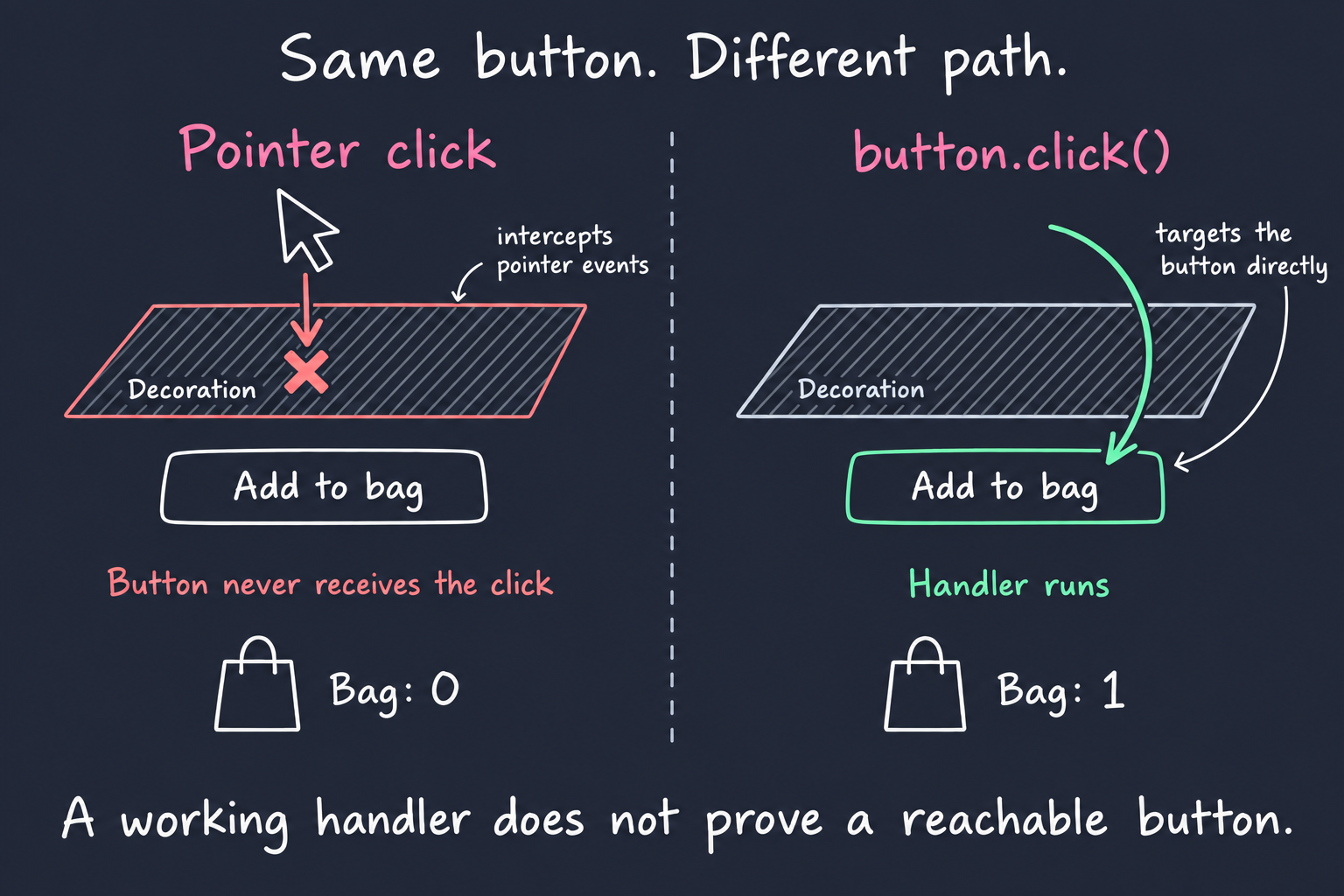
This particular false green comes from the environment’s limits. Changing the assertion’s wording won’t expose the overlay.
Run the Same Intention in a Browser
Vitest Browser Mode runs test code in a real browser. With the Playwright provider, locator actions use browser automation.
The Vue test looks familiar:
// app/catalog/ProductCard.browser.test.ts
import { expect, test } from "vitest";
import { render } from "vitest-browser-vue";
import ProductCardHost from "../../tests/fixtures/ProductCardHost.vue";

test("adds a plush to the bag through the product button", async () => {
  const screen = await render(ProductCardHost);

  await screen
    .getByRole("button", { name: "Add The little claw plush to bag" })
    .click({ timeout: 1500 });

  await expect
    .element(screen.getByLabelText("Bag count"))
    .toHaveTextContent("1 items in bag");
});
The recorded Chromium run fails at the click. Here’s the diagnostic, shortened to the relevant lines:
TimeoutError: locator.click: Timeout 1500ms exceeded.

- element is visible, enabled and stable
- done scrolling
- <span class="product-decoration">…</span> intercepts pointer events
The bag assertion never runs. Playwright checks whether the button can receive pointer events before clicking it. The decoration prevents that check from passing. See Playwright’s actionability checks.
Restoring pointer-events: none lets the click reach the button again.
Keep the locator action here. Calling element().click() dispatches a programmatic click and bypasses the interaction you’re trying to verify.
Add Browser Mode to a Vue Project
You can follow the setup with a Vue 3 and Vite project. The shop excerpts later in this post come from the Claw & Chew repository.
For a new project:
pnpm create vite vue-browser-demo --template vue-ts
cd vue-browser-demo
pnpm install
Add the test dependencies and Chromium. These are the Vitest and Vue adapter versions used by the shop demo:
pnpm add -D vitest@5.0.0 @vitest/browser-playwright@5.0.0 vitest-browser-vue@3.1.0 playwright
pnpm exec playwright install chromium
Keep the runner and provider versions aligned. Preserve your existing Vite configuration, including Vue and any CSS plugins your components need.
// vitest.config.ts
import { defineConfig, mergeConfig } from "vitest/config";
import { playwright } from "@vitest/browser-playwright";
import viteConfig from "./vite.config";

export default mergeConfig(
  viteConfig,
  defineConfig({
    test: {
      include: ["src/**/*.browser.test.ts"],
      browser: {
        enabled: true,
        provider: playwright(),
        instances: [{ browser: "chromium" }],
        viewport: { width: 1100, height: 850 },
      },
    },
  }),
);
This configuration assumes an object-based Vite config. If your config exports a function, resolve its environment-specific options before merging.
Use a small component to verify the setup:
<!-- src/components/Counter.vue -->
<script setup lang="ts">
import { ref } from "vue";
const count = ref(0);
</script>

<template>
  <button type="button" @click="count++">Count is {{ count }}</button>
</template>
// src/components/Counter.browser.test.ts
import { expect, test } from "vitest";
import { render } from "vitest-browser-vue";
import Counter from "./Counter.vue";
test("increments when clicked", async () => {
const screen = await render(Counter);
const counter = screen.getByRole("button", { name: /count is/i });
await counter.click();
await expect.element(counter).toHaveTextContent("Count is 1");
});Run it once without opening a browser window:
pnpm exec vitest run --browser.headlessAwait rendering, interactions, and expect.element assertions. Locators describe how to find an element, allowing assertions to retry while Vue updates the page.
When adding Browser Mode to an existing suite, use separate Vitest projects with non-overlapping file patterns. Keep pure logic tests in Node. Import application CSS through a browser setup file when your component doesn’t import it itself.
Test the Purchase Across Real Components
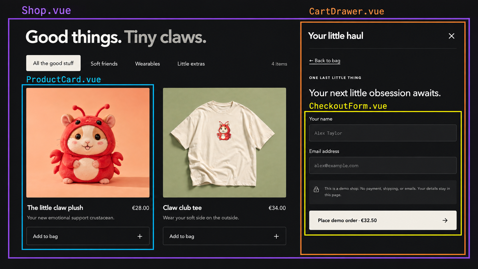
A frontend is a tree of components. Rendering a parent can exercise its real children together.
The shop combines a product card, cart drawer, and checkout form. A purchase test should cross those boundaries:
Start with the actions directly in the test:
// Purchase test body after: const screen = await render(Shop)
await screen
  .getByRole("button", {
    name: "Add The little claw plush to bag",
  })
  .click();
await screen.getByRole("button", { name: "Open bag, 1 items" }).click();
await screen.getByRole("button", { name: "Checkout" }).click();
await screen.getByRole("textbox", { name: "Your name" }).fill("Claw Fan");
await screen
  .getByRole("textbox", {
    name: "Email address",
  })
  .fill("fan@example.com");
await screen.getByRole("button", { name: /^Place demo order/ }).click();
await expect
  .element(
    screen.getByRole("heading", {
      name: "Small claws. Big thank you.",
    }),
  )
  .toBeVisible();
That test observes the shop through its public UI. It doesn’t inspect a private cart ref or call a checkout method directly.
Keep the children real when their collaboration is what you’re testing. Control external services at explicit boundaries. In this demo, the confirmation represents a demo order; it doesn’t prove that a payment provider accepted money.
Extract Repeated Actions into a Page Object
When several tests repeat the purchase steps, a small helper can name those actions. A factory renders the shop and returns the page object:
// talk/tacon/shop-page.ts
import { render } from "vitest-browser-vue";
import Shop from "../../app/components/Shop.vue";

export async function renderShop() {
  const screen = await render(Shop);
  return {
    confirmation: screen.getByRole("heading", {
      name: "Small claws. Big thank you.",
    }),
    async addPlushAndCheckout() {
      await screen
        .getByRole("button", {
          name: "Add The little claw plush to bag",
        })
        .click();
      await screen.getByRole("button", { name: "Open bag, 1 items" }).click();
      await screen.getByRole("button", { name: "Checkout" }).click();
    },
    async enterCustomer({ name, email }: { name: string; email: string }) {
      await screen.getByRole("textbox", { name: "Your name" }).fill(name);
      await screen.getByRole("textbox", { name: "Email address" }).fill(email);
    },
    async placeOrder() {
      await screen.getByRole("button", { name: /^Place demo order/ }).click();
    },
  };
}
Now the test describes a purchase. The assertion stays visible in the test:
// talk/tacon/purchase.browser.test.ts
import { expect, test } from "vitest";
import { renderShop } from "./shop-page";

test("a customer can order a plush", async () => {
  const shop = await renderShop();
  await shop.addPlushAndCheckout();
  await shop.enterCustomer({
    name: "Claw Fan",
    email: "fan@example.com",
  });
  await shop.placeOrder();
  await expect.element(shop.confirmation).toBeVisible();
});
Adapt the test include pattern if you keep tests under talk/ rather than src/. The factory is just a function. Add it when repeated setup or interaction steps justify the abstraction.
2. Accessibility: Can People Operate the Interface?
Completing a purchase with a mouse doesn’t establish that someone can operate the interface with a keyboard.
The talk uses account tabs to show another failure. After an arrow-key interaction, the visible panel changes to Password. The accessibility state still reports Account as selected.
The pixels look plausible. The reported state is wrong.
One tab. Two different stories.
Click a tab or use ← →. Watch what the accessibility tree reports.
My account
Account
Manage your profile details.
- Name
- "Account"
- Role
- tabpanel
- Focusable
- true
Account visible. Account reported.
The defect keeps ARIA on Account while the visible content changes. Toggle the defect to compare.
Tree illustration derived from this demo’s ARIA attributes, not a DevTools capture.
View the runnable source
<script setup lang="ts">
import { computed, ref, useId as createDemoId } from "vue";
import "./demo.css";
type Tab = "Account" | "Password";
// Avoid React Fast Refresh treating this Vue call as a React hook in dev.
const id = createDemoId();
const broken = ref(true);
const selected = ref<Tab>("Account");
const account = ref<HTMLButtonElement | null>(null);
const password = ref<HTMLButtonElement | null>(null);
const semanticName = computed(() =>
broken.value ? "Account" : selected.value,
);
const summary = computed(
() =>
`Visible panel: ${selected.value}. Reported selection: ${semanticName.value}. ${selected.value === semanticName.value ? "They agree." : "They disagree."}`,
);
const description = computed(() =>
selected.value === "Account"
? "Manage your profile details."
: "Change your password here.",
);
const mismatch = computed(() => selected.value !== semanticName.value);
function navigate(event: KeyboardEvent) {
if (!["ArrowRight", "ArrowLeft", "Home", "End"].includes(event.key)) return;
event.preventDefault();
selected.value =
event.key === "Home"
? "Account"
: event.key === "End"
? "Password"
: selected.value === "Account"
? "Password"
: "Account";
(selected.value === "Account" ? account.value : password.value)?.focus();
}
</script>
<template>
<section
class="contract-demo not-prose"
aria-label="Tabs accessibility playground"
>
<div class="demo-heading">
<div>
<span class="eyebrow">TRY IT · ACCESSIBILITY</span>
<h3>One tab. Two different stories.</h3>
<p>
Click a tab or use ← →. Watch what the accessibility tree reports.
</p>
</div>
<div class="toolbar">
<button
class="defect-toggle"
type="button"
:aria-pressed="broken"
aria-label="ARIA defect"
@click="broken = !broken"
>
<span>Defect {{ broken ? "active" : "off" }}</span
><span class="switch-track" aria-hidden="true"><span /></span>
</button>
<button
class="reset"
type="button"
@click="
broken = true;
selected = 'Account';
"
>
Reset demo
</button>
</div>
</div>
<div class="comparison">
<div class="shop">
<header class="shop-header">
<span class="brand">Claw & Chew</span
><span>Shop / My account</span>
</header>
<div class="shop-body">
<div class="account-heading">
<div>
<span class="eyebrow">YOUR LITTLE CORNER</span>
<h4>My account</h4>
</div>
<img
src="/images/testing-contracts/plush.png"
alt=""
width="48"
height="48"
/>
</div>
<div
role="tablist"
aria-label="Manage your account"
@keydown="navigate"
>
<button
:id="`${id}-account`"
ref="account"
type="button"
role="tab"
:aria-selected="semanticName === 'Account'"
:aria-controls="`${id}-panel`"
:tabindex="selected === 'Account' ? 0 : -1"
:class="{ active: selected === 'Account' }"
@click="selected = 'Account'"
>
Account
</button>
<button
:id="`${id}-password`"
ref="password"
type="button"
role="tab"
:aria-selected="semanticName === 'Password'"
:aria-controls="`${id}-panel`"
:tabindex="selected === 'Password' ? 0 : -1"
:class="{ active: selected === 'Password' }"
@click="selected = 'Password'"
>
Password
</button>
</div>
<div
:id="`${id}-panel`"
role="tabpanel"
:aria-labelledby="`${id}-${semanticName.toLowerCase()}`"
tabindex="0"
>
<h4>{{ selected }}</h4>
<p>{{ description }}</p>
<div class="sample-field" aria-hidden="true">
<span>{{
selected === "Account" ? "Display name" : "New password"
}}</span>
<div>{{ selected === "Account" ? "Alex" : "••••••••••••" }}</div>
</div>
</div>
</div>
</div>
<div class="inspector-column">
<div class="inspector" role="region" aria-label="Semantic readout">
<div class="inspector-tabs">
<span>Elements</span><span class="current">Accessibility</span
><span class="dots" aria-hidden="true">⋮</span>
</div>
<div class="tree-heading">
<strong>Accessibility tree</strong><span>Live illustration</span>
</div>
<div class="tree-rows">
<div class="tree-row">
<span class="marker">▾</span
><span
><span class="token-role">tablist</span>
<span class="token-string">"Manage your account"</span></span
>
</div>
<div
v-for="tab in ['Account', 'Password'] as const"
:key="tab"
class="tree-row child"
>
<span class="marker">·</span
><span
><span class="token-role">tab</span>
<span class="token-string">"{{ tab }}"</span></span
><span v-if="semanticName === tab" class="selected-badge"
>selected</span
>
</div>
<div class="tree-row panel-row">
<span class="marker">▾</span
><span
><span class="token-role">tabpanel</span>
<span :key="semanticName" class="token-string changed"
>"{{ semanticName }}"</span
></span
>
</div>
<div class="tree-row child">
<span class="marker">·</span
><span
><span class="token-role">heading</span>
<span :key="selected" class="token-string changed"
>"{{ selected }}"</span
></span
>
</div>
<div class="tree-row child">
<span class="marker">·</span
><span
><span class="token-role">StaticText</span>
<span :key="description" class="token-string changed"
>"{{ description }}"</span
></span
>
</div>
</div>
<div class="properties-heading">▾ Computed properties</div>
<dl class="properties">
<dt>Name</dt>
<dd :key="semanticName" class="token-string changed">
"{{ semanticName }}"
</dd>
<dt>Role</dt>
<dd class="token-string">tabpanel</dd>
<dt>Focusable</dt>
<dd class="token-boolean">true</dd>
</dl>
</div>
<p
class="comparison-status"
:class="{ mismatch }"
role="status"
:aria-label="summary"
>
<span aria-hidden="true">{{ mismatch ? "×" : "✓" }}</span>
{{ selected }} visible. {{ semanticName }} reported.
</p>
</div>
</div>
<p class="footnote">
{{
broken
? "The defect keeps ARIA on Account while the visible content changes."
: "ARIA now follows the selected tab. The visible and reported states agree."
}}
Toggle the defect to compare.
</p>
<p class="caption">
Tree illustration derived from this demo’s ARIA attributes, not a DevTools
capture.
</p>
</section>
</template>
<style scoped>
.contract-demo {
container-type: inline-size;
background: #222735;
border-color: #434b5d;
padding: clamp(16px, 3vw, 28px);
}
.demo-heading {
margin-bottom: 22px;
}
.eyebrow {
font-size: 10px;
font-weight: 600;
letter-spacing: 0.15em;
}
.demo-heading .eyebrow {
color: #e88ee4;
}
.contract-demo h3 {
margin: 8px 0;
font-size: clamp(22px, 3vw, 30px);
font-weight: 650;
letter-spacing: -0.03em;
}
.demo-heading p {
font-size: 14px;
color: #c6cad5;
margin: 0;
}
.toolbar {
display: flex;
align-items: center;
justify-content: space-between;
margin-top: 16px;
gap: 12px;
}
.contract-demo .defect-toggle {
display: inline-flex;
align-items: center;
gap: 10px;
border: 0;
background: transparent;
padding: 0;
font-size: 13px;
}
.switch-track {
width: 36px;
height: 22px;
padding: 3px;
border-radius: 20px;
background: #747e90;
}
.switch-track span {
display: block;
width: 16px;
height: 16px;
background: #222735;
border-radius: 50%;
transition: transform 0.18s;
}
[aria-pressed="true"] .switch-track {
background: #e97be4;
}
[aria-pressed="true"] .switch-track span {
transform: translateX(14px);
}
.contract-demo .reset {
border: 0;
background: transparent;
color: #c6cad5;
font-size: 12px;
padding: 4px 0 4px 12px;
text-decoration: underline;
text-underline-offset: 4px;
}
.comparison {
display: grid;
grid-template-columns: minmax(0, 1fr) minmax(0, 1fr);
gap: 18px;
align-items: start;
}
.shop {
color: #302d28;
background: #f3eee4;
border-radius: 12px;
overflow: hidden;
}
.shop-header {
display: flex;
align-items: center;
justify-content: space-between;
flex-wrap: wrap;
gap: 6px;
padding: 16px 20px;
border-bottom: 1px solid #d7d0c3;
background: #fffbf3;
font-size: 10px;
color: #6b675f;
}
.brand {
font:
700 24px/1.2 Georgia,
serif;
letter-spacing: -0.05em;
color: #302d28;
}
.shop-body {
padding: 22px 20px 24px;
}
.account-heading {
display: flex;
justify-content: space-between;
align-items: center;
gap: 12px;
margin-bottom: 18px;
}
.account-heading .eyebrow {
color: #7c6048;
font-size: 9px;
}
.contract-demo .account-heading h4 {
color: #302d28;
font:
700 30px/1.2 Georgia,
serif;
margin: 6px 0 0;
letter-spacing: -0.03em;
}
.account-heading img {
width: 44px;
height: 44px;
border-radius: 50%;
object-fit: cover;
margin: 0;
}
[role="tablist"] {
display: flex;
gap: 18px;
border-bottom: 1px solid #bdb3a2;
}
.contract-demo [role="tab"] {
padding: 8px 2px;
min-height: 44px;
background: transparent;
color: #726c62;
border: 0;
border-bottom: 3px solid transparent;
border-radius: 0;
font-size: 15px;
}
.contract-demo [role="tab"].active {
color: #302d28;
border-bottom-color: #805c3c;
font-weight: 600;
}
[role="tabpanel"] {
margin-top: 18px;
}
.contract-demo [role="tabpanel"] h4 {
color: #302d28;
font-size: 20px;
margin: 0;
font-weight: 600;
}
.contract-demo [role="tabpanel"] p {
color: #6b655c;
font-size: 13px;
margin: 6px 0 18px;
min-height: 40px;
}
.shop :focus-visible {
outline-color: #805c3c;
outline-offset: 2px;
}
.sample-field {
font-size: 12px;
}
.sample-field > div {
border: 1px solid #b9af9e;
border-radius: 5px;
padding: 10px;
margin-top: 5px;
background: #fffbf3;
}
.inspector {
background: #202224;
border: 1px solid #55565a;
border-radius: 10px;
overflow: hidden;
font-size: 11px;
}
.inspector-tabs {
display: flex;
align-items: center;
gap: 20px;
padding: 0 12px;
background: #282a2d;
color: #b9bdc4;
border-bottom: 1px solid #505257;
}
.inspector-tabs > span {
padding: 8px 0;
}
.inspector-tabs .current {
color: #9ebcff;
border-bottom: 2px solid #9ebcff;
font-weight: 600;
}
.inspector-tabs .dots {
margin-left: auto;
}
.tree-heading {
display: flex;
justify-content: space-between;
flex-wrap: wrap;
gap: 4px;
padding: 10px 12px;
}
.tree-heading > span {
color: #b9bdc4;
font-size: 9px;
}
.tree-rows {
padding: 0 0 12px;
font:
13px/1.8 ui-monospace,
SFMono-Regular,
Consolas,
monospace;
}
.tree-row {
display: flex;
align-items: baseline;
gap: 5px;
padding: 2px 10px;
overflow-wrap: anywhere;
}
.marker {
color: #bbc0ca;
flex: 0 0 8px;
}
.child {
padding-left: 22px;
}
.token-role {
margin-right: 0.5ch;
color: #abc5ff;
}
.token-string {
color: #ecaaa2;
}
.token-boolean {
color: #b096ff;
}
.selected-badge {
margin-left: auto;
color: #add8b3;
font-size: 10px;
}
.panel-row {
background: #3d4d69;
}
.properties-heading {
border-block: 1px solid #4b4d52;
padding: 8px 12px;
font-weight: 600;
}
.properties {
display: grid;
grid-template-columns: 1fr 1.2fr;
gap: 4px 8px;
margin: 0;
padding: 12px;
font:
13px/1.6 ui-monospace,
SFMono-Regular,
Consolas,
monospace;
}
.properties dt {
color: #bec1c8;
}
.properties dd {
margin: 0;
}
.contract-demo .comparison-status {
color: #add8b3;
font-size: 12px;
margin: 10px 0 0;
font-weight: 600;
}
.contract-demo .comparison-status.mismatch {
color: #f09cb0;
}
.contract-demo .footnote {
color: #d5d8e0;
font-size: 13px;
margin: 18px 0 6px;
}
.contract-demo .caption {
color: #aeb5c5;
font-size: 11px;
margin: 0;
}
.changed {
animation: highlight 0.7s ease-out;
}
@keyframes highlight {
from {
background: #77643d;
}
to {
background: transparent;
}
}
@media (prefers-reduced-motion: reduce) {
.changed {
animation: none;
}
.switch-track span {
transition: none;
}
}
@container (max-width: 560px) {
.comparison {
grid-template-columns: 1fr;
}
.tree-rows,
.properties {
font-size: 12px;
}
}
</style>Shared styles: demo.css
.contract-demo {
  color: #eceff5;
  background: #172031;
  border: 1px solid #566277;
  border-radius: 12px;
  padding: clamp(16px, 4vw, 24px);
  font:
    16px/1.55 system-ui,
    sans-serif;
  margin: 24px 0;
}
.contract-demo *,
.contract-demo *::before,
.contract-demo *::after {
  box-sizing: border-box;
}
.contract-demo p {
  margin: 12px 0;
  color: inherit;
}
.contract-demo h3,
.contract-demo h4 {
  margin: 0 0 12px;
  color: #fff;
  font:
    700 20px/1.3 system-ui,
    sans-serif;
}
.contract-demo .demo-controls {
  display: flex;
  gap: 12px;
  flex-wrap: wrap;
  align-items: center;
  margin: 16px 0;
}
.contract-demo button,
.contract-demo select {
  font: inherit;
  color: #eceff5;
  background: #273449;
  border: 1px solid #91a0b7;
  border-radius: 6px;
  padding: 10px 14px;
  cursor: pointer;
  min-height: 44px;
}
.contract-demo button:disabled {
  cursor: default;
  opacity: 0.6;
}
.contract-demo button[aria-pressed="true"] {
  border-color: #f77fe2;
  background: #53334e;
}
.contract-demo :focus-visible {
  outline: 3px solid #ffe291;
  outline-offset: 4px;
}
.contract-demo label {
  display: flex;
  align-items: center;
  gap: 10px;
  flex-wrap: wrap;
}
.contract-demo input[type="checkbox"] {
  width: 20px;
  height: 20px;
  accent-color: #f77fe2;
}
.contract-demo .demo-stage {
  padding: 20px;
  border: 1px solid #8190a8;
  border-radius: 8px;
  background: #202c40;
}
.contract-demo .demo-primary {
  background: #f77fe2;
  border: 2px solid #f77fe2;
  color: #172031;
  font-weight: 700;
}
.contract-demo .demo-readout {
  display: block;
  padding: 12px;
  background: #101824;
  border-radius: 6px;
  margin-top: 16px;
  overflow-wrap: anywhere;
}
.contract-demo .demo-note {
  color: #c7d1e1;
  font-size: 14px;
}
.contract-demo code {
  background: #101824;
  color: #ffb8ed;
  padding: 2px 5px;
  white-space: normal;
  overflow-wrap: anywhere;
}
.contract-demo pre {
  white-space: pre-wrap;
  overflow-wrap: anywhere;
  padding: 16px;
  background: #101824;
  color: #eceff5;
  font-size: 14px;
}
.contract-demo .demo-comparison {
  display: grid;
  grid-template-columns: repeat(auto-fit, minmax(min(100%, 210px), 1fr));
  gap: 16px;
}
.contract-demo figure {
  margin: 0;
  min-width: 0;
}
.contract-demo figcaption {
  margin-bottom: 12px;
  font-weight: 700;
  color: inherit;
}
The Vue Playground link opens an editable copy of this component and its styles. It runs the demo UI; it does not run Vitest.
For tabs, check the relationship between keyboard input, focus, selection, and visible content. An ARIA snapshot records roles, names, and states in a readable format:
// Inside a browser test, after keyboard navigation to Password
const tabs = screen.getByRole("tablist");
await expect.element(tabs).toMatchAriaInlineSnapshot(`
  - tablist "Manage your account":
    - tab "Account"
    - tab "Password" [selected]
`);

await expect
  .element(screen.getByRole("tab", { name: "Password" }))
  .toHaveFocus();
await expect
  .element(screen.getByRole("tabpanel", { name: "Password" }))
  .toBeVisible();
This excerpt assumes the test has already rendered the tabs and performed the keyboard interaction. Snapshotting the tab list alone doesn’t establish focus or panel visibility, so those expectations remain explicit.
Add axe for Automated Rules
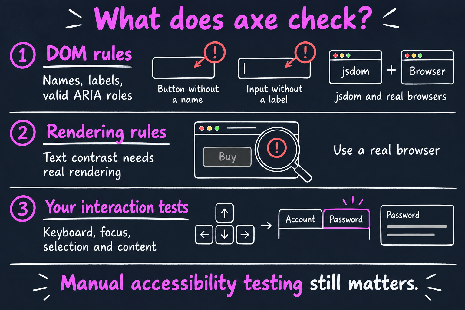
axe-core checks accessibility rules against the current DOM. Some rules work in jsdom; others need rendering information. Its documentation calls out jsdom’s lack of support for the color-contrast rule.
Install axe in the project containing your component tests:
pnpm add -D axe-coreThe shop has a focused contrast test for its checkout notice:
// app/checkout/CheckoutForm.browser.test.ts, focused excerpt
import { expect, test } from "vitest";
import { render } from "vitest-browser-vue";
import axe from "axe-core";
import CheckoutForm from "./CheckoutForm.vue";

test("the checkout notice has sufficient contrast", async () => {
  const screen = await render(CheckoutForm, { props: { total: 2250 } });
  const notice = screen.getByText(/This is a demo shop\./);
  await expect.element(notice).toBeVisible();

  const results = await axe.run(notice.element(), {
    runOnly: ["color-contrast"],
  });
  expect(results.violations.map((rule) => rule.id)).toEqual([]);
  expect(results.incomplete).toEqual([]);
});
The second assertion matters. An incomplete result means the engine couldn’t decide. For this controlled fixture, an undecided contrast check shouldn’t count as success.
Removing runOnly runs axe’s default rules within the selected scope. Test meaningful states, such as an open dialog or a displayed validation error. A scan of the initial render doesn’t cover every later state.
Semantic locators, keyboard tests, ARIA assertions, and axe each answer different questions. Add manual keyboard and assistive-technology testing to assess what automation misses.
3. Appearance: Does the UI Match the Approved Design?
A button can still work after a CSS change gives it the wrong color. The purchase test can pass while the design regresses.
A visual regression test compares the rendered component with an approved reference. Vitest provides toMatchScreenshot for that comparison:
// Inside a browser test for the shop's ProductCardHost fixture
const screen = await render(ProductCardHost);
const artwork = screen
  .getByRole("img", {
    name: "The little claw plush",
  })
  .element();

if (!(artwork instanceof HTMLImageElement)) {
  throw new Error("Product image is missing");
}
await artwork.decode();
await document.fonts.ready;

await expect(screen.getByRole("article")).toMatchScreenshot("plush-card");
Load the real styles. Fix the viewport, wait for images and fonts, and control changing data. Keep the browser, operating system, and font environment consistent between reference creation and comparison.
Choose a useful capture area. A product card makes a more focused reference than a full page containing unrelated content.
Try a Visual Change
It still clicks. Does it still look right?
Both galleries use the approved styles.
These are two live HTML illustrations, not a saved screenshot or a pixel diff. Run the article's toMatchScreenshot test to compare real image baselines.
View the runnable source
<script setup lang="ts">
import { computed, ref } from "vue";
import "./demo.css";

type Defect = "none" | "color" | "spacing" | "missing";
const defect = ref<Defect>("none");
const count = ref(0);
const variants = ["Primary", "Outline", "Disabled"] as const;
const description = computed(
  () =>
    ({
      none: "Both galleries use the approved styles.",
      color:
        "The primary button changed color. Its click behavior still works.",
      spacing: "The button spacing changed. Its click behavior still works.",
      missing: "The disabled variant is absent. The other buttons still work.",
    })[defect.value],
);
</script>

<template>
  <section class="contract-demo" aria-label="Visual regression playground">
    <h3>It still clicks. Does it still look right?</h3>
    <div class="demo-controls">
      <label
        >Visual change
        <select v-model="defect">
          <option value="none">No defect</option>
          <option value="color">Wrong color</option>
          <option value="spacing">Wrong spacing</option>
          <option value="missing">Missing variant</option>
        </select>
      </label>
      <button
        type="button"
        @click="
          defect = 'none';
          count = 0;
        "
      >
        Reset demo
      </button>
    </div>
    <div class="demo-comparison">
      <figure>
        <figcaption>Reference illustration</figcaption>
        <div class="demo-stage gallery" aria-label="Reference gallery">
          <span
            v-for="variant in variants"
            :key="variant"
            class="reference-button"
            :class="variant.toLowerCase()"
            >{{ variant }}</span
          >
        </div>
      </figure>
      <figure>
        <figcaption>Current: try Primary</figcaption>
        <div
          class="demo-stage gallery"
          :class="defect"
          role="group"
          aria-label="Current gallery"
        >
          <template v-for="variant in variants" :key="variant">
            <button
              v-if="!(variant === 'Disabled' && defect === 'missing')"
              type="button"
              :class="variant.toLowerCase()"
              :disabled="variant === 'Disabled'"
              @click="count++"
            >
              {{ variant }}
            </button>
          </template>
        </div>
      </figure>
    </div>
    <output class="demo-readout" aria-label="Successful clicks"
      >Successful clicks: {{ count }}</output
    >
    <p role="status">{{ description }}</p>
    <p class="demo-note">
      These are two live HTML illustrations, not a saved screenshot or a pixel
      diff. Run the article's toMatchScreenshot test to compare real image
      baselines.
    </p>
  </section>
</template>

<style scoped>
.gallery {
  display: grid;
  gap: 12px;
}
.reference-button,
.gallery button {
  display: block;
  border: 2px solid #91a0b7;
  border-radius: 6px;
  background: #273449;
  color: #eceff5;
  text-align: center;
  padding: 10px 14px;
  min-height: 44px;
  font:
    600 16px/1.55 system-ui,
    sans-serif;
}
.gallery .primary {
  background: #f77fe2;
  color: #172031;
  border-color: #f77fe2;
}
.gallery .outline {
  background: transparent;
  border-color: #f77fe2;
}
.gallery .disabled {
  opacity: 0.6;
}
.gallery.color .primary {
  background: #99e8d0;
  border-color: #99e8d0;
}
.gallery.spacing {
  gap: 28px;
}
</style>
Shared styles: demo.css
.contract-demo {
  color: #eceff5;
  background: #172031;
  border: 1px solid #566277;
  border-radius: 12px;
  padding: clamp(16px, 4vw, 24px);
  font:
    16px/1.55 system-ui,
    sans-serif;
  margin: 24px 0;
}
.contract-demo *,
.contract-demo *::before,
.contract-demo *::after {
  box-sizing: border-box;
}
.contract-demo p {
  margin: 12px 0;
  color: inherit;
}
.contract-demo h3,
.contract-demo h4 {
  margin: 0 0 12px;
  color: #fff;
  font:
    700 20px/1.3 system-ui,
    sans-serif;
}
.contract-demo .demo-controls {
  display: flex;
  gap: 12px;
  flex-wrap: wrap;
  align-items: center;
  margin: 16px 0;
}
.contract-demo button,
.contract-demo select {
  font: inherit;
  color: #eceff5;
  background: #273449;
  border: 1px solid #91a0b7;
  border-radius: 6px;
  padding: 10px 14px;
  cursor: pointer;
  min-height: 44px;
}
.contract-demo button:disabled {
  cursor: default;
  opacity: 0.6;
}
.contract-demo button[aria-pressed="true"] {
  border-color: #f77fe2;
  background: #53334e;
}
.contract-demo :focus-visible {
  outline: 3px solid #ffe291;
  outline-offset: 4px;
}
.contract-demo label {
  display: flex;
  align-items: center;
  gap: 10px;
  flex-wrap: wrap;
}
.contract-demo input[type="checkbox"] {
  width: 20px;
  height: 20px;
  accent-color: #f77fe2;
}
.contract-demo .demo-stage {
  padding: 20px;
  border: 1px solid #8190a8;
  border-radius: 8px;
  background: #202c40;
}
.contract-demo .demo-primary {
  background: #f77fe2;
  border: 2px solid #f77fe2;
  color: #172031;
  font-weight: 700;
}
.contract-demo .demo-readout {
  display: block;
  padding: 12px;
  background: #101824;
  border-radius: 6px;
  margin-top: 16px;
  overflow-wrap: anywhere;
}
.contract-demo .demo-note {
  color: #c7d1e1;
  font-size: 14px;
}
.contract-demo code {
  background: #101824;
  color: #ffb8ed;
  padding: 2px 5px;
  white-space: normal;
  overflow-wrap: anywhere;
}
.contract-demo pre {
  white-space: pre-wrap;
  overflow-wrap: anywhere;
  padding: 16px;
  background: #101824;
  color: #eceff5;
  font-size: 14px;
}
.contract-demo .demo-comparison {
  display: grid;
  grid-template-columns: repeat(auto-fit, minmax(min(100%, 210px), 1fr));
  gap: 16px;
}
.contract-demo figure {
  margin: 0;
  min-width: 0;
}
.contract-demo figcaption {
  margin-bottom: 12px;
  font-weight: 700;
  color: inherit;
}
The Vue Playground link opens an editable copy of this component and its styles. It runs the demo UI; it does not run Vitest.
Change the color or spacing, then click Primary in the current gallery. The count still increases. Remove a variant to see another appearance change that a click test on Primary wouldn’t cover.
A Gallery Makes Coverage Deliberate
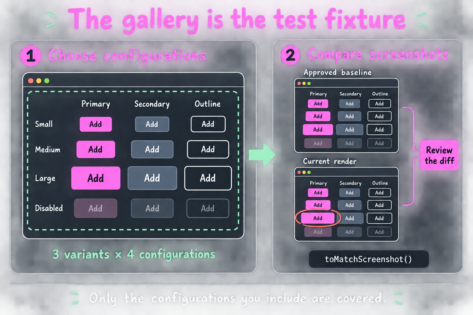
The talk uses three button variants across four chosen configurations in one fixture. A screenshot covers the whole gallery.
// ButtonVariantGallery.browser.test.ts
import { expect, test } from "vitest";
import { render } from "vitest-browser-vue";
import Gallery from "./ButtonVariantGallery.vue";

test("preserves the approved button configurations", async () => {
  const screen = await render(Gallery);
  await document.fonts.ready;

  await expect(
    screen.getByRole("region", {
      name: "Button variants",
    }),
  ).toMatchScreenshot("button-variants");
});
The English fixture needs aria-label="Button variants" on its section. The gallery intentionally supplies the variants and states you want to protect.
A missing button, changed spacing, or clipped label can then produce a diff. The test can’t discover a variant you never included.
For the shop, useful references include focused and invalid inputs, a checkout with a long product name, and key responsive layouts. Pick these from actual design risks.
Review Diffs Before Updating References
The normal pull-request check should compare screenshots and expose failures. For an intentional change, generate replacement references in the same environment, inspect the images, and commit them.
With the single browser configuration above, the update command is:
pnpm exec vitest run --browser.headless --updateScope that command to your visual test project or files in a larger suite. Keep it out of the ordinary comparison job.
A red diff asks for a decision. Updating every reference automatically would remove that decision.
My Vue visual regression guide covers the complete gallery, baseline workflow, and a deliberate CSS regression.
Choose the Environment from the Question
The three contracts now have concrete examples:
| Contract | Shop example | Evidence |
|---|---|---|
| Behavior | A customer completes the demo order | Actions followed by a visible confirmation |
| Accessibility | Keyboard input, focus, and tab selection agree | Interaction tests, ARIA assertions, and axe |
| Appearance | Approved button configurations remain intact | A reviewed screenshot comparison |
Those are test goals. Node, jsdom, and Browser Mode are environment choices. A component can participate in an integration test when you render it with real children.
My default arrangement is:
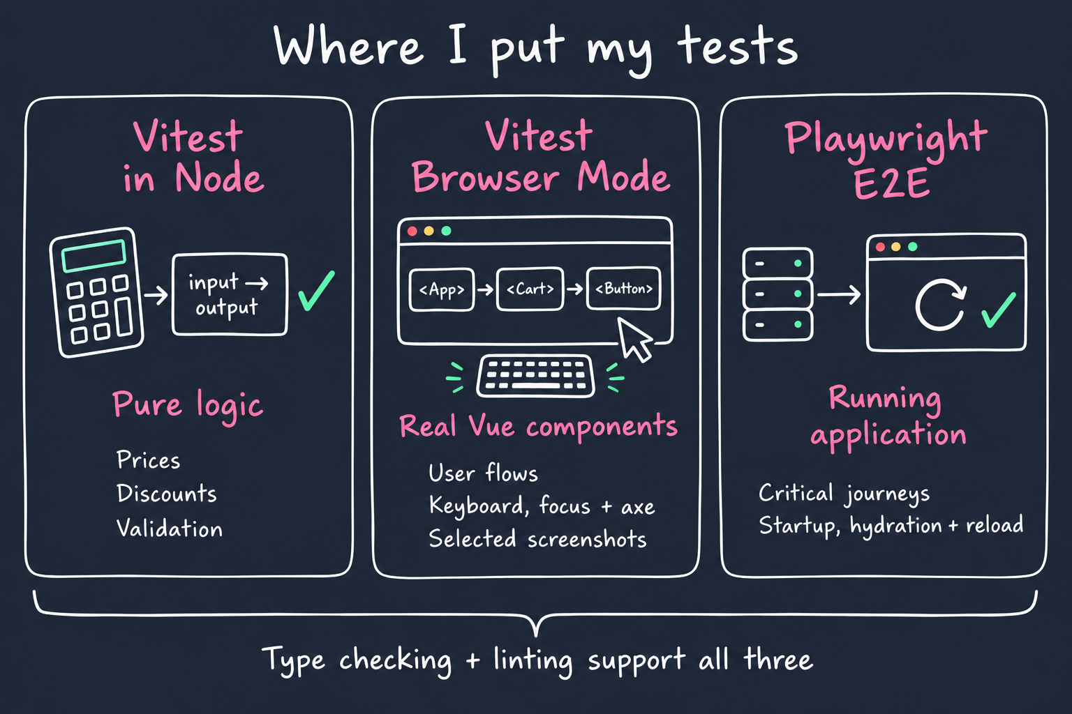
Type checking and linting support all three. There’s no fixed percentage that makes this arrangement correct for every project.
Browser Mode also costs browser startup and interaction time. Measure your own suite rather than assuming it will always beat jsdom. The reason to move this purchase test is the failure it can detect.
A Real Example: npmx.dev
The talk also examines the installation feature in npmx.dev. At the inspected revision, its tests ask different questions at different levels:
- A Node test checks the generated install command, such as
pnpm add lodash@4.17.21. - A component test runs an axe audit on the package-manager selector.
- Separate E2E tests exercise dropdown keyboard behavior and copying the command to the clipboard.
The axe audit doesn’t prove the dropdown’s keyboard interaction. The E2E interaction doesn’t replace the command-generation cases. Each assertion covers a specific part of installing a package.
Keep the Application Boundary Visible
Rendering Shop.vue in a browser doesn’t reproduce Nuxt’s entire startup path. It doesn’t fetch server-rendered HTML and hydrate that exact response.
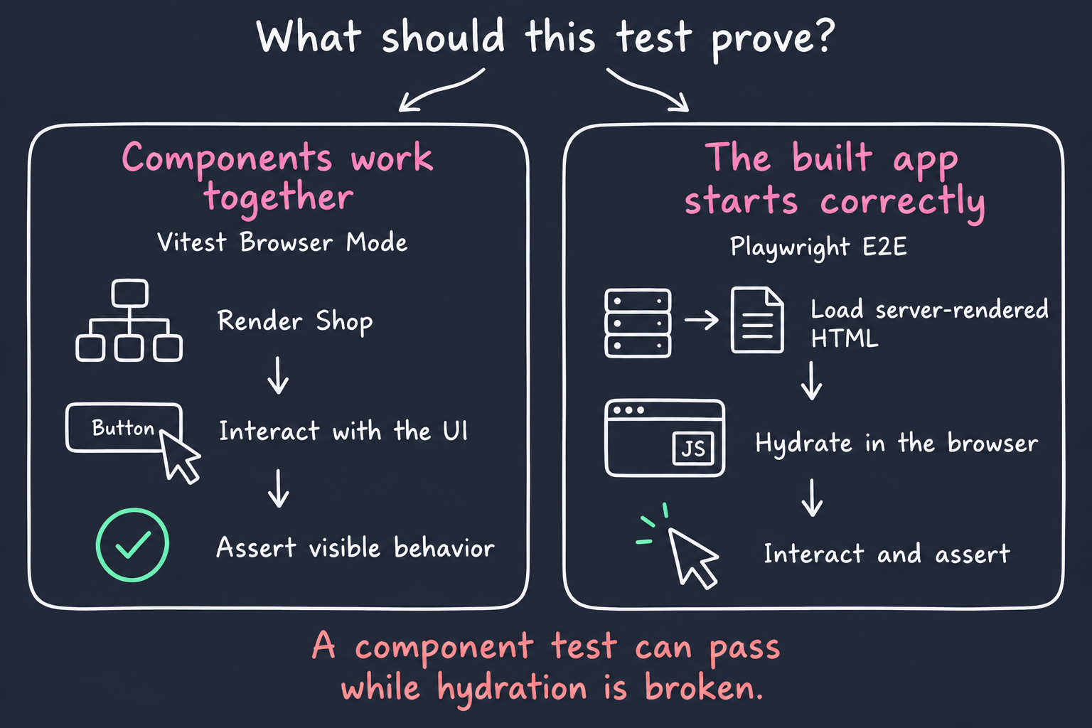
A component test can pass while a server/client mismatch breaks hydration. Keep an E2E test against the built application for that risk. Reloading persisted data and reaching real server routes also require the corresponding application setup.
For a client-only SPA, rendering the root component can cover substantial behavior. It still proves only the dependencies and boundaries present in that test.
Render Your Components in a Real Browser
If you’re still using jsdom or happy-dom for your UI component tests in 2026, I think you’re making a huge mistake. Use Vitest Browser Mode and let your components render in a real browser, with real CSS, layout, and browser interactions.