A button can still emit the right event after a CSS change turns it red. A click test passes. A visual regression test compares its appearance with an approved screenshot and flags the difference.
With Vitest 5, you can render a Vue component in Chromium and compare it with a PNG baseline using toMatchScreenshot():
await expect
  .element(screen.getByRole("button", { name: "Save changes" }))
  .toMatchScreenshot("primary-medium");
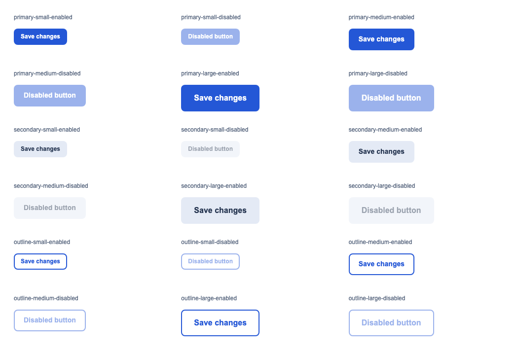
This guide builds a gallery of 18 button configurations, captures a baseline, and introduces a CSS regression to prove the comparison works.
Updated for Vitest 5
Native screenshot comparison arrived in Vitest 4. This update uses Vitest 5.0.0 and vitest-browser-vue 3.1.0. It replaces the original workspace configuration, manual DOM rendering, and base64 snapshot helper with the APIs tested below.
Install the Browser Testing Dependencies
Start with a Vue 3 and Vite project. Vitest 5 requires Node.js 22.12 or later and Vite 6.4 or later. See the Vitest 5 migration guide.
Install the test runner, Playwright provider, Vue adapter, and jsdom:
pnpm add -D --save-exact vitest@5.0.0 @vitest/browser-playwright@5.0.0 vitest-browser-vue@3.1.0 playwright@1.63.0 jsdom@30.0.1
pnpm exec playwright install chromium
The unit project below uses jsdom. The browser project runs components in Chromium through Playwright. Keep the Vitest runner and provider versions aligned.
The verification project used Vue 3.5.42, Vite 8.3.0, and @vitejs/plugin-vue 6.0.9. Its strict type check used vue-tsc 3.3.11 with TypeScript 5.9.3.
TypeScript compatibility
With these versions, vue-tsc failed with TypeScript 7.0.2 because it tried to load the removed typescript/lib/tsc entry point. Pinning TypeScript 5.9.3 fixed the build. Preserve a working compiler setup when adding browser tests to an existing project.
Configure Unit and Browser Projects
Create vitest.config.ts at the project root:
import vue from "@vitejs/plugin-vue";
import { playwright } from "@vitest/browser-playwright";
import { defineConfig } from "vitest/config";

export default defineConfig({
  plugins: [vue()],
  optimizeDeps: { include: ["vue", "vitest-browser-vue"] },
  test: {
    projects: [
      {
        test: {
          name: "unit",
          include: ["src/**/*.spec.ts"],
          exclude: ["src/**/*.browser.spec.ts"],
          environment: "jsdom",
        },
      },
      {
        test: {
          name: "browser",
          include: ["src/**/*.browser.spec.ts"],
          browser: {
            enabled: true,
            provider: playwright(),
            headless: true,
            instances: [
              { browser: "chromium", viewport: { width: 1280, height: 900 } },
            ],
          },
        },
      },
    ],
  },
});
Use test.projects instead of a separate vitest.workspace.ts. In Vitest 5, inline projects inherit the root configuration, including the Vue plugin, by default.
The optimizeDeps.include entry comes from the verification run. Without it, Vite reloaded the tests during dependency optimization and Vue failed while rendering slots. Prebundling Vue and the adapter resolved the failure.
The fixed viewport gives the gallery the same available space on each run. The file patterns keep .browser.spec.ts files out of the unit project. See the Browser Mode setup guide for other providers and project arrangements.
Add these scripts to package.json:
{
  "scripts": {
    "test": "vitest",
    "test:unit": "vitest --project unit",
    "test:browser": "vitest --project browser",
    "test:update": "vitest run --project browser --update"
  }
}
After adding the tests below, run either project in watch mode, or add --run for a single run:
pnpm test:unit --run
pnpm test:browser --run
Create the BaseButton Component
Create src/components/BaseButton.vue. Give optional props defaults so a button without explicit props still renders with the medium, primary styles:
<script setup lang="ts">
withDefaults(
  defineProps<{
    size?: "small" | "medium" | "large";
    variant?: "primary" | "secondary" | "outline";
    disabled?: boolean;
  }>(),
  { size: "medium", variant: "primary", disabled: false },
);
defineEmits<{ click: [event: MouseEvent] }>();
</script>
<template>
  <button
    type="button"
    :class="['button', `button--${size}`, `button--${variant}`]"
    :disabled="disabled"
    @click="$emit('click', $event)"
  >
    <slot />
  </button>
</template>
<style scoped>
.button {
  display: inline-flex;
  align-items: center;
  justify-content: center;
  border: 2px solid transparent;
  border-radius: 8px;
  font-family: Arial, sans-serif;
  font-weight: 600;
  line-height: 1.4;
  cursor: pointer;
}
.button--small {
  padding: 6px 12px;
  font-size: 12px;
}
.button--medium {
  padding: 10px 18px;
  font-size: 14px;
}
.button--large {
  padding: 14px 24px;
  font-size: 16px;
}
.button--primary {
  background: #2457d6;
  color: #ffffff;
}
.button--secondary {
  background: #e4eaf5;
  color: #22324e;
}
.button--outline {
  background: #ffffff;
  border-color: #2457d6;
  color: #2457d6;
}
.button:hover:not(:disabled) {
  filter: brightness(0.9);
}
.button:focus-visible {
  outline: 3px solid #a855f7;
  outline-offset: 3px;
}
.button:disabled {
  opacity: 0.45;
  cursor: not-allowed;
}
</style>
These are the complete styles used for the screenshots. If your components depend on application CSS, import that CSS into your browser test setup too.
Define the Button Stories
A story describes one configuration to render. You don’t need a separate story tool for this example.
Create src/components/buttonStories.ts:
import type BaseButton from "./BaseButton.vue";
type ButtonProps = Pick<
  InstanceType<typeof BaseButton>["$props"],
  "variant" | "size" | "disabled"
>;
export interface ButtonStory {
  name: string;
  props: ButtonProps;
  label: string;
}
export const buttonStories: ButtonStory[] = (
  ["primary", "secondary", "outline"] as const
).flatMap((variant) =>
  (["small", "medium", "large"] as const).flatMap((size) =>
    [false, true].map((disabled) => ({
      name: `${variant}-${size}-${disabled ? "disabled" : "enabled"}`,
      props: { variant, size, disabled },
      label: disabled ? "Disabled button" : "Save changes",
    })),
  ),
);
This matrix covers three variants, three sizes, and both disabled states: 18 combinations. Deriving ButtonProps from the component keeps the story data checked against its public props.
Add src/components/buttonStories.spec.ts to check that the matrix covers the expected combinations. This file runs in the unit project:
import { expect, test } from "vitest";
import { buttonStories } from "./buttonStories";
test("covers all 18 unique variant, size, and disabled combinations", () => {
  expect(buttonStories).toHaveLength(18);
  expect(new Set(buttonStories.map((story) => story.name)).size).toBe(18);
  expect(buttonStories.filter((story) => story.props.disabled)).toHaveLength(9);
});
Render the Gallery with Vue
Create src/components/ButtonVariants.vue:
<script setup lang="ts">
import BaseButton from "./BaseButton.vue";
import { buttonStories } from "./buttonStories";
</script>
<template>
  <section
    class="gallery"
    data-testid="button-variants"
    aria-label="Button variants"
  >
    <div v-for="story in buttonStories" :key="story.name" class="story">
      <h2>{{ story.name }}</h2>
      <BaseButton v-bind="story.props">{{ story.label }}</BaseButton>
    </div>
  </section>
</template>
<style scoped>
.gallery {
  box-sizing: border-box;
  width: 100%;
  max-width: 1050px;
  display: grid;
  grid-template-columns: repeat(3, minmax(0, 1fr));
  gap: 24px;
  padding: 28px;
  background: #ffffff;
  color: #172033;
  font-family: Arial, sans-serif;
}
.story {
  min-height: 90px;
}
h2 {
  margin: 0 0 16px;
  font-size: 12px;
  font-weight: 400;
  color: #52617a;
}
</style>
The fixture owns the labels, spacing, and background. Its data-testid gives the test a single target for the gallery screenshot. Each button still uses the real component and its scoped styles.
Compare the Gallery with a Baseline
Create src/components/BaseButton.browser.spec.ts alongside the components:
import { expect, test } from "vitest";
import { render } from "vitest-browser-vue";
import ButtonVariants from "./ButtonVariants.vue";

test("all button variants", async () => {
  const screen = await render(ButtonVariants);
  await document.fonts.ready;

  await expect
    .element(screen.getByTestId("button-variants"))
    .toMatchScreenshot("all-button-variants");
});
Await render() with the updated Vue adapter. Await the screenshot assertion too. The default vitest-browser-vue import registers cleanup between tests, so the test doesn’t need to append or remove DOM containers.
toMatchScreenshot() handles capture, comparison, and failure reporting. The old expect(screenshot).toBeTruthy() only checked that a screenshot result existed. Comparing base64 text also missed the image-specific diagnostics available here.
Run the browser project:
pnpm test:browser --runOn the first local run, Vitest creates the missing reference image and fails with a message asking you to review it. Open the PNG and check the layout, labels, colors, and disabled states. Then run the test again to compare against that reference.
For this test on macOS Chromium, the reference lives at:
src/components/__screenshots__/BaseButton.browser.spec.ts/
  all-button-variants-chromium-darwin.png
Commit approved reference PNGs with the test. Browser and platform names distinguish baselines from different environments.
Prove That a CSS Regression Fails
Once the gallery passes, change the primary background in BaseButton.vue:
.button--primary {
  background: #e11d48;
  color: #ffffff;
}
Run the browser project again without --update. In the verification project, changing blue to red produced this failure:
Screenshot does not match the stored reference.
33092 pixels (ratio 0.05) differ.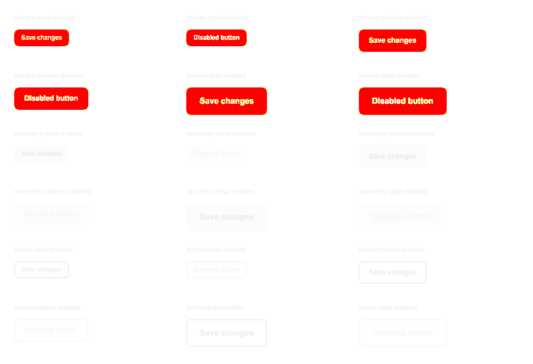
Vitest reports the reference, actual screenshot, and diff image when available. In the tested version, the actual and diff images appeared under .vitest/attachments/src/components/BaseButton.browser.spec.ts/.
Restore background: #2457d6 and rerun the test. It should pass against the unchanged reference. This gives you evidence that the test detects a styling change before you depend on it.
For an intentional design change, update the references:
pnpm test:updateReview the changed PNGs before committing. Running an update whenever a test fails would accept accidental regressions too.
Add Screenshots for Individual States
The gallery gives you an overview. Separate screenshots identify which configuration changed without inspecting the whole gallery.
Add these imports and the parameterized test to BaseButton.browser.spec.ts:
import BaseButton from "./BaseButton.vue";
import { buttonStories } from "./buttonStories";

test.each(buttonStories)("visual: $name", async ({ name, props, label }) => {
  const screen = await render(BaseButton, {
    props,
    slots: { default: label },
  });
  await document.fonts.ready;

  await expect
    .element(screen.getByRole("button", { name: label }))
    .toMatchScreenshot(name);
});
This adds 18 reference images. As before, inspect new baselines before accepting them.
For keyboard focus, capture enough space around the button to include its outline. An element screenshot cropped to the button’s box can omit an outline drawn outside it:
import { page, userEvent } from "vitest/browser";

test("keyboard focus appearance", async () => {
  const screen = await render(BaseButton, {
    slots: { default: "Save changes" },
  });
  screen.container.style.cssText =
    "display: inline-block; padding: 12px; background: white";

  await userEvent.tab();
  const button = page.getByRole("button", { name: "Save changes" });
  await expect.element(button).toHaveFocus();
  await expect.element(screen.container).toMatchScreenshot("keyboard-focus");
});
Keep behavior tests alongside visual tests. A screenshot of a disabled button checks its appearance; an assertion such as toBeDisabled() checks its disabled state. Click and keyboard tests check whether users can activate the enabled button.
Keep Screenshot Runs Consistent
Use the same OS, browser version, fonts, and viewport when generating and comparing references. A macOS baseline doesn’t establish what a Linux CI run should look like.
Commit the lockfile and install the matching Playwright browser in the environment that runs these tests. For Linux CI, Playwright can install system dependencies too:
pnpm exec playwright install --with-deps chromium
pnpm test:browser --run
The verification here covered local macOS Chromium. Review Linux references in your CI environment before using them to gate changes.
Wait for the UI state you intend to capture. document.fonts.ready waits for fonts, but it doesn’t wait for your API response or an image to finish loading. Use fixed test data and assert that loading has finished before taking the screenshot.
Vitest retries captures to find a stable image. Its Playwright screenshot assertion disables animations by default. Those defaults help, but you still need to choose a repeatable state. See the visual regression testing guide for comparison options and environment setup.
What the Verification Covered
The separate Vue/Vite project passed 23 tests: the gallery, 18 individual screenshots, keyboard focus, two behavior tests, and one unit test for the story matrix. Strict Vue/TypeScript checking and the production build passed too.
The deliberate color change failed with an image diff, and restoring the CSS passed against the original baseline. That capture, review, fail, and restore cycle is the workflow to establish for your own base components.