Recently, I’ve been exploring Claude.ai’s new CSV analysis feature, which allows you to upload spreadsheet data for automated analysis and visualization. In this blog post, I’ll demonstrate how to leverage Claude.ai’s capabilities using Readwise data as an example. We’ll explore how crafting better prompts can help you extract more meaningful insights from your data. Additionally, we’ll peek under the hood to understand the technical aspects of how Claude processes and analyzes this information.
Readwise is a powerful application that syncs and organizes highlights from your Kindle and other reading platforms. While this tutorial uses Readwise data as an example, the techniques demonstrated here can be applied to analyze any CSV dataset with Claude.
The Process: From Highlights to Insights
1. Export and Initial Setup
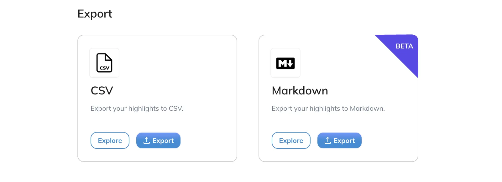
First things first: export your Readwise highlights as CSV.
Just login into your Readwise account and go to -> https://readwise.io/export
Scroll down to the bottom and click on “Export to CSV”

2. Upload the CSV into Claude
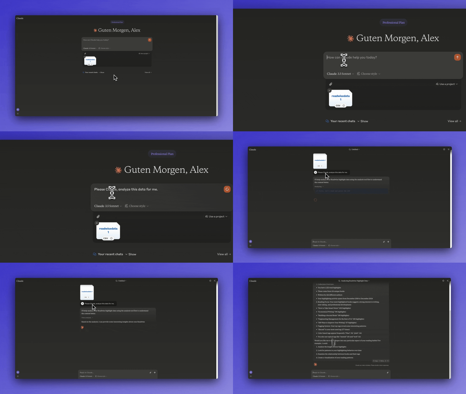
Drop that CSV into Claude’s interface. Yes, it’s that simple. No need for complex APIs or coding knowledge.
Note: The CSV file must fit within Claude’s conversation context window. For very large export files, you may need to split them into smaller chunks.
3. Use Prompts to analyze the data
a) First Approach
First we will use a generic Prompt to see what would happen if we don’t even know what to analyze for:
Please Claude, analyze this data for me.
Claude analyzed my Readwise data and provided a high-level overview:
- Collection stats: 1,322 highlights across 131 books by 126 authors from 2018-2024
- Most highlighted books focused on writing and note-taking, with “How to Take Smart Notes” leading at 102 highlights
- Tag analysis showed “discard” as most common (177), followed by color tags and topical tags like “mental” and “tech”
Claude also offered to dive deeper into highlight lengths, reading patterns over time, tag relationships, and data visualization. Even with this basic prompt, Claude provides valuable insights and analysis. The initial overview can spark ideas for deeper investigation and more targeted analysis. However, we can craft more specific prompts to extract even more meaningful insights from our data.
4. Visualization and Analysis
While our last Prompt did give use some insights, it was not very useful for me. Also I am a visual person, so I want to see some visualizations.
This is why I created this Prompt to get better Visualization I also added the Colors from this blog since I love them.
Create a responsive data visualization dashboard for my Readwise highlights using React and Recharts.

Theme Colors (Dark Mode):
- Background: rgb(33, 39, 55)
- Text: rgb(234, 237, 243)
- Accent: rgb(255, 107, 237)
- Card Background: rgb(52, 63, 96)
- Muted Elements: rgb(138, 51, 123)
- Borders: rgb(171, 75, 153)

Color Application:
- Use background color for main dashboard
- Apply text color for all typography
- Use accent color for interactive elements and highlights
- Apply card background for visualization containers
- Use muted colors for secondary information
- Implement borders for section separation

Input Data Structure:
- CSV format with columns:
  - Highlight text
  - Book Title
  - Book Author
  - Color
  - Tags
  - Location
  - Highlighted Date

Required Visualizations:
1. Reading Analytics:
   - Average reading time per book (calculated from highlight timestamps)
   - Reading patterns by time of day (heatmap using card background and accent colors)
   - Heat map showing active reading days
     - Base: rgb(52, 63, 96)
     - Intensity levels: rgb(138, 51, 123) → rgb(255, 107, 237)

2. Content Analysis:
   - Vertical bar chart: Top 10 most highlighted books
   - Bars: gradient from rgb(138, 51, 123) to rgb(255, 107, 237)
   - Labels: rgb(234, 237, 243)
   - Grid lines: rgba(171, 75, 153, 0.2)

3. Timeline View:
   - Monthly highlighting activity
   - Line color: rgb(255, 107, 237)
   - Area fill: rgba(255, 107, 237, 0.1)
   - Grid: rgba(171, 75, 153, 0.15)

4. Knowledge Map:
   - Interactive mind map using force-directed graph
   - Node colors: rgb(52, 63, 96)
   - Node borders: rgb(171, 75, 153)
   - Connections: rgba(255, 107, 237, 0.6)
   - Hover state: rgb(255, 107, 237)

5. Summary Statistics Card:
   - Background: rgb(52, 63, 96)
   - Border: rgb(171, 75, 153)
   - Headings: rgb(234, 237, 243)
   - Values: rgb(255, 107, 237)

Design Requirements:
- Typography:
  - Primary font: Light text on dark background
  - Base text: rgb(234, 237, 243)
  - Minimum 16px for body text
  - Headings: rgb(255, 107, 237)

- Card Design:
  - Background: rgb(52, 63, 96)
  - Border: 1px solid rgb(171, 75, 153)
  - Border radius: 8px
  - Box shadow: 0 4px 6px rgba(0, 0, 0, 0.1)

- Interaction States:
  - Hover: Accent color rgb(255, 107, 237)
  - Active: rgb(138, 51, 123)
  - Focus: 2px solid rgb(255, 107, 237)

- Responsive Design:
  - Desktop: Grid layout with 2-3 columns
  - Tablet: 2 columns
  - Mobile: Single column, stacked
  - Gap: 1.5rem
  - Padding: 2rem

Accessibility:
- Ensure contrast ratio ≥ 4.5:1 with text color
- Use rgba(234, 237, 243, 0.7) for secondary text
- Provide focus indicators using accent color
- Include aria-labels for interactive elements
- Support keyboard navigation

Performance:
- Implement CSS variables for theme colors
- Use CSS transitions for hover states
- Optimize SVG rendering for mind map
- Implement virtualization for large datasets
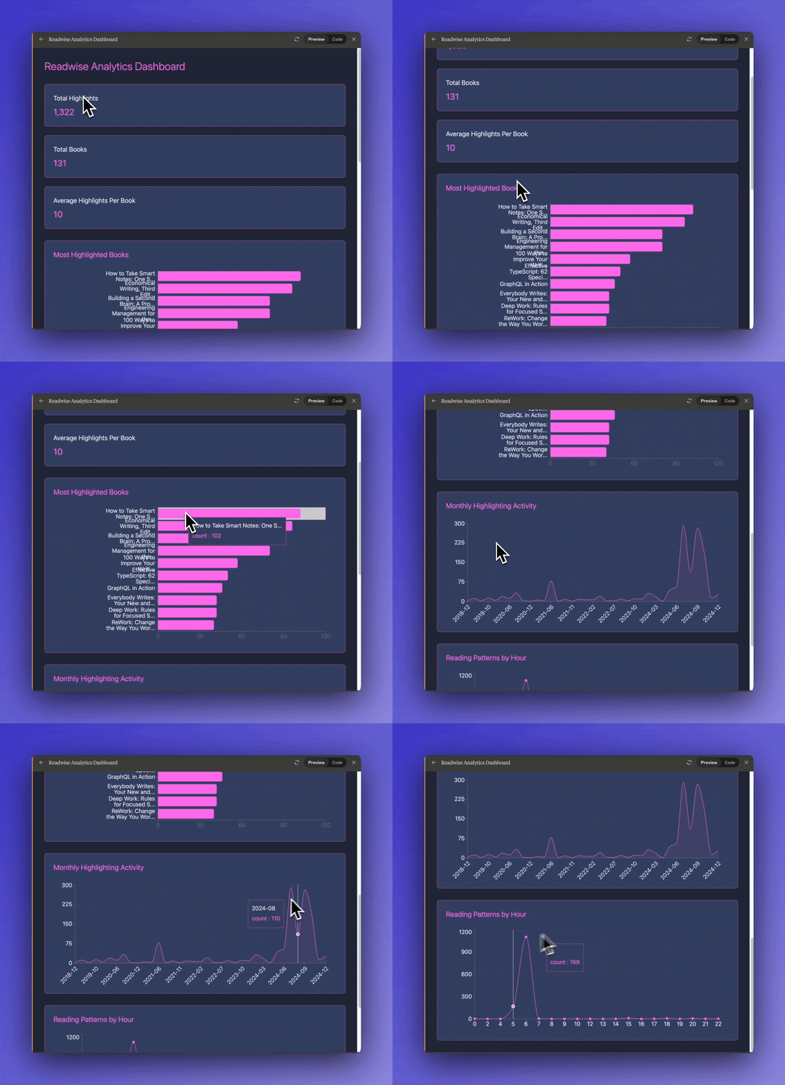
The interactive dashboard generated by Claude demonstrates the powerful synergy between generative AI and data analysis. By combining Claude’s natural language processing capabilities with programmatic visualization, we can transform raw reading data into actionable insights. This approach allows us to extract meaningful patterns and trends that would be difficult to identify through manual analysis alone.
Now I want to give you some tips on how to get the best out of claude.
Writing Effective Analysis Prompts
Here are key principles for crafting prompts that generate meaningful insights:
1. Start with Clear Objectives
Instead of vague requests, specify what you want to learn:
Analyze my reading data to identify:
1. Time-of-day reading patterns
2. Most engaged topics
3. Knowledge connection opportunities
4. Potential learning gaps
2. Use Role-Based Prompting
Give Claude a specific expert perspective:
Act as a learning science researcher analyzing my reading patterns.
Focus on:
- Comprehension patterns
- Knowledge retention indicators
- Learning efficiency metrics
3. Request Specific Visualizations
Be explicit about the visual insights you need:
Create visualizations showing:
1. Daily reading heatmap
2. Topic relationship network
3. Highlight frequency trends
Use theme-consistent colors for clarity
Bonus: Behind the Scenes - How the Analysis Tool Works
For those curious about the technical implementation, let’s peek under the hood at how Claude uses the analysis tool to process your Readwise data:
The JavaScript Runtime Environment
When you upload your Readwise CSV, Claude has access to a JavaScript runtime environment similar to a browser’s console. This environment comes pre-loaded with several powerful libraries:
// Available libraries
import Papa from "papaparse"; // For CSV processing
import _ from "lodash"; // For data manipulation
import React from "react"; // For UI components
import { BarChart, LineChart, PieChart } from "recharts"; // For visualizations
Data Processing Pipeline
The analysis happens in two main stages:
- Initial Data Processing:
async function analyzeReadingData() {
  // Read the CSV file
  const fileContent = await window.fs.readFile("readwisedata.csv", {
    encoding: "utf8",
  });

  // Parse CSV using Papaparse
  const parsedData = Papa.parse(fileContent, {
    header: true,
    skipEmptyLines: true,
    dynamicTyping: true,
  });

  // Analyze time patterns
  const timeAnalysis = parsedData.data.map(row => {
    const date = new Date(row["Highlighted at"]);
    return {
      hour: date.getHours(),
      title: row["Book Title"],
      tags: row["Tags"],
    };
  });

  // Group and count data using lodash
  const hourlyDistribution = _.countBy(timeAnalysis, "hour");
  console.log("Reading time distribution:", hourlyDistribution);
}- Visualization Component:
const ReadingPatterns = () => {
  const [timeData, setTimeData] = useState([]);
  const [topBooks, setTopBooks] = useState([]);

  useEffect(() => {
    const analyzeData = async () => {
      const response = await window.fs.readFile("readwisedata.csv", {
        encoding: "utf8",
      });

      // Process time data for visualization
      const timeAnalysis = parsedData.data.reduce((acc, row) => {
        const hour = new Date(row["Highlighted at"]).getHours();
        acc[hour] = (acc[hour] || 0) + 1;
        return acc;
      }, {});

      // Format data for charts
      const timeDataForChart = Object.entries(timeAnalysis).map(
        ([hour, count]) => ({
          hour: `${hour}:00`,
          count,
        })
      );

      setTimeData(timeDataForChart);
    };
    analyzeData();
  }, []);

  return (
    <div className="w-full space-y-8 p-4">
      <ResponsiveContainer width="100%" height="100%">
        <BarChart data={timeData}>
          <CartesianGrid strokeDasharray="3 3" />
          <XAxis dataKey="hour" />
          <YAxis />
          <Bar dataKey="count" fill="#4F46E5" />
        </BarChart>
      </ResponsiveContainer>
    </div>
  );
};
Key Technical Features
-
Asynchronous File Handling: The
window.fs.readFileAPI provides async file access, similar to Node.js’s fs/promises. -
Data Processing Libraries:
- Papaparse handles CSV parsing with options for headers and type conversion
- Lodash provides efficient data manipulation functions
- React and Recharts enable interactive visualizations
-
React Integration:
- Components use hooks for state management
- Tailwind classes for styling
- Responsive container adapts to screen size
-
Error Handling: The code includes proper error boundaries and async/await patterns to handle potential issues gracefully.
This technical implementation allows Claude to process your reading data efficiently while providing interactive visualizations that help you understand your reading patterns better.
Conclusion
I hope this blog post demonstrates how AI can accelerate data analysis workflows. What previously required significant time and technical expertise can now be accomplished in minutes. This democratization of data analysis empowers people without coding backgrounds to gain valuable insights from their own data.