Why You Need Theme-Aware Technical Diagrams in Your Astro Blog
Technical bloggers often face a common challenge: creating diagrams seamlessly integrating with their site’s design system. While tools like Excalidraw make it easy to create beautiful diagrams, maintaining their visual consistency across different theme modes can be frustrating. This is especially true when your Astro blog supports light and dark modes. This tutorial will solve this problem by building a custom solution that automatically adapts your Excalidraw diagrams to match your site’s theme.
Common Challenges with Technical Diagrams in Web Development
When working with Excalidraw, we face several issues:
- Exported SVGs come with fixed colors
- Diagrams don’t automatically adapt to dark mode
- Maintaining separate versions for different themes is time-consuming
- Lack of interactive elements and smooth transitions
Before vs After: The Impact of Theme-Aware Diagrams
Standard Export
Here’s how a typical Excalidraw diagram looks without any customization:
With Our Solution
And here’s the same diagram using our custom component:
Building a Theme-Aware Excalidraw Component for Astro
We’ll create an Astro component that transforms static Excalidraw exports into dynamic, theme-aware diagrams. Our solution will:
- Automatically adapt to light and dark modes
- Support your custom design system colors
- Add interactive elements and smooth transitions
- Maintain accessibility standards
💡 Quick Start: Need an Astro blog first? Use AstroPaper as your starter or build from scratch. This tutorial focuses on the diagram component itself.
Step-by-Step Implementation Guide
1. Implementing the Theme System
First, let’s define the color variables that will power our theme-aware diagrams:
html[data-theme="light"] {
  --color-fill: 250, 252, 252;
  --color-text-base: 34, 46, 54;
  --color-accent: 211, 0, 106;
  --color-card: 234, 206, 219;
  --color-card-muted: 241, 186, 212;
  --color-border: 227, 169, 198;
}

html[data-theme="dark"] {
  --color-fill: 33, 39, 55;
  --color-text-base: 234, 237, 243;
  --color-accent: 255, 107, 237;
  --color-card: 52, 63, 96;
  --color-card-muted: 138, 51, 123;
  --color-border: 171, 75, 153;
}
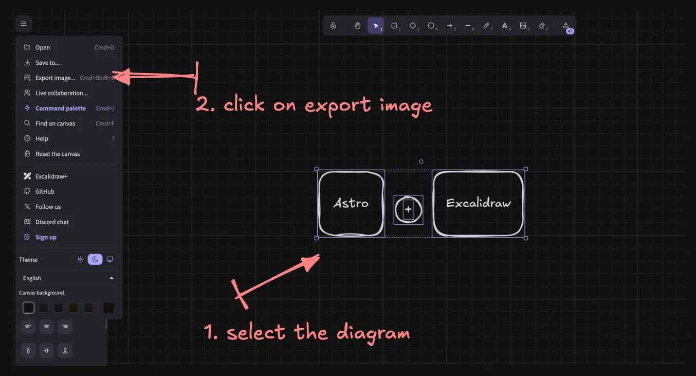
2. Creating Optimized Excalidraw Diagrams
Follow these steps to prepare your diagrams:
- Create your diagram at Excalidraw
- Export the diagram:
- Select your diagram
- Click the export button

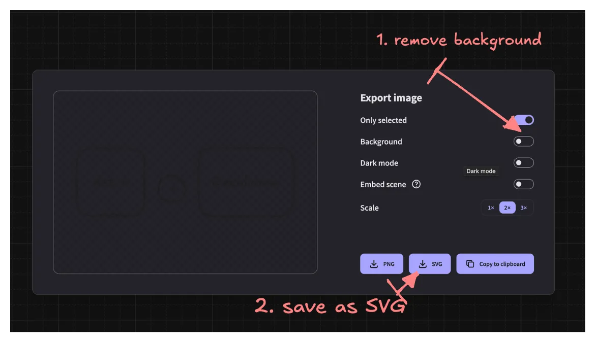
- Configure export settings:
- Uncheck “Background”
- Choose SVG format
- Click “Save”

3. Building the ExcalidrawSVG Component
Here’s our custom Astro component that handles the theme-aware transformation:
---
import type { ImageMetadata } from "astro";

interface Props {
  src: ImageMetadata | string;
  alt: string;
  caption?: string;
}

const { src, alt, caption } = Astro.props;

const svgUrl = typeof src === "string" ? src : src.src;
---

<figure class="excalidraw-figure">
  <div class="excalidraw-svg" data-svg-url={svgUrl} aria-label={alt}>
    <img src={svgUrl} alt={alt} style="display: none;" />
  </div>
  {caption && <figcaption>{caption}</figcaption>}
</figure>

<script>
  function modifySvg(svgString: string): string {
    const parser = new DOMParser();
    const doc = parser.parseFromString(svgString, "image/svg+xml");
    const svg = doc.documentElement;

    svg.setAttribute("width", "100%");
    svg.setAttribute("height", "100%");
    svg.classList.add("w-full", "h-auto");

    doc.querySelectorAll("text").forEach(text => {
      text.removeAttribute("fill");
      text.classList.add("fill-skin-base");
    });

    doc.querySelectorAll("rect").forEach(rect => {
      rect.removeAttribute("fill");
      rect.classList.add("fill-skin-soft");
    });

    doc.querySelectorAll("path").forEach(path => {
      path.removeAttribute("stroke");
      path.classList.add("stroke-skin-accent");
    });

    doc.querySelectorAll("g").forEach(g => {
      g.classList.add("excalidraw-element");
    });

    return new XMLSerializer().serializeToString(doc);
  }

  function initExcalidrawSVG() {
    const svgContainers =
      document.querySelectorAll<HTMLElement>(".excalidraw-svg");
    svgContainers.forEach(async container => {
      const svgUrl = container.dataset.svgUrl;
      if (svgUrl) {
        try {
          const response = await fetch(svgUrl);
          if (!response.ok) {
            throw new Error(`Failed to fetch SVG: ${response.statusText}`);
          }
          const svgData = await response.text();
          const modifiedSvg = modifySvg(svgData);
          container.innerHTML = modifiedSvg;
        } catch (error) {
          console.error("Error in ExcalidrawSVG component:", error);
          container.innerHTML = `<svg xmlns="http://www.w3.org/2000/svg" viewBox="0 0 100 100">
            <text x="10" y="50" fill="red">Error loading SVG</text>
          </svg>`;
        }
      }
    });
  }

  // Run on initial page load
  document.addEventListener("DOMContentLoaded", initExcalidrawSVG);

  // Run on subsequent navigation
  document.addEventListener("astro:page-load", initExcalidrawSVG);
</script>

<style>
  .excalidraw-figure {
    @apply my-8 w-full max-w-full overflow-hidden;
  }
  .excalidraw-svg {
    @apply w-full max-w-full overflow-hidden;
  }
  :global(.excalidraw-svg svg) {
    @apply h-auto w-full;
  }
  :global(.excalidraw-svg .fill-skin-base) {
    @apply fill-[rgb(34,46,54)] dark:fill-[rgb(234,237,243)];
  }
  :global(.excalidraw-svg .fill-skin-soft) {
    @apply fill-[rgb(234,206,219)] dark:fill-[rgb(52,63,96)];
  }
  :global(.excalidraw-svg .stroke-skin-accent) {
    @apply stroke-[rgb(211,0,106)] dark:stroke-[rgb(255,107,237)];
  }
  :global(.excalidraw-svg .excalidraw-element) {
    @apply transition-all duration-300;
  }
  :global(.excalidraw-svg .excalidraw-element:hover) {
    @apply opacity-80;
  }
  figcaption {
    @apply mt-4 text-center text-sm italic text-skin-base;
  }
</style>
4. Using the Component
Integrate the component into your MDX blog posts:
💡 Note: We need to use MDX so that we can use the ExcalidrawSVG component in our blog posts. You can read more about MDX here.
---
import ExcalidrawSVG from '@features/mdx-components/components/ExcalidrawSVG.astro';
import myDiagram from '../assets/my-diagram.svg';
---

# My Technical Blog Post

<ExcalidrawSVG
  src={myDiagram}
  alt="Architecture diagram"
  caption="System architecture overview"
/>
Best Practices and Tips for Theme-Aware Technical Diagrams
-
Simplicity and Focus
- Keep diagrams simple and focused for better readability
- Avoid cluttering with unnecessary details
-
Consistent Styling
- Use consistent styling across all diagrams
- Maintain a uniform look and feel throughout your documentation
-
Thorough Testing
- Test thoroughly in both light and dark modes
- Ensure diagrams are clear and legible in all color schemes
-
Accessibility Considerations
- Consider accessibility when choosing colors and contrast
- Ensure diagrams are understandable for users with color vision deficiencies
-
Smooth Transitions
- Implement smooth transitions for theme changes
- Provide a seamless experience when switching between light and dark modes
Conclusion
With this custom component, you can now create technical diagrams that seamlessly integrate with your Astro blog’s design system. This solution eliminates the need for maintaining multiple versions of diagrams while providing a superior user experience through smooth transitions and interactive elements.